
Understanding the Difference Between “Alternates” and “Ligatures” in Glyph Fonts

Example of using Monstario Serif Font
In the world of typography and digital fonts, two powerful OpenType features often used to enhance the visual style of text are “Alternates” and “Ligatures.” While both influence the appearance of characters, they serve different purposes and function in distinct ways. This article will help you clearly understand the difference between the two and how to use them effectively in your design work.
✏️What Are Alternates?
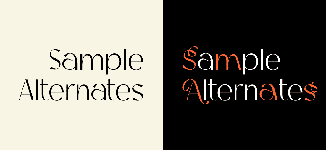
Alternates (or Alternative Glyphs) are stylistic variations of a single character within a font. They provide different visual options for the same letter, typically used for aesthetic reasons or to match a particular design tone.
Example Usage:
- A standard letter “a” may have an alternate version with an extended tail or ornamental style.
- Uppercase letters may have elegant or calligraphic alternates, useful for invitations or logos.
Types of Alternates:
- Stylistic Alternates (salt): Alternate visual styles for characters.
- Swash: Characters with long decorative strokes, common in script fonts.
- Titling Alternates: Uppercase letters styled specifically for use in headlines or titles.
Example of using Bagina Serif Font
✏️ What Are Ligatures?
Ligatures are combinations of two or more characters that are joined into a single glyph. Originally created to improve text readability and avoid visual collisions between letters, ligatures are now also used for decorative purposes.
Example Ligatures:
- Common letter pairs like “fi”, “fl”, “ff”, or “tt” are often combined into a single, unified glyph.
Types of Ligatures:
- Standard Ligatures (liga): Commonly used letter combinations automatically substituted (e.g., “fi”).
- Discretionary Ligatures (dlig): Optional, more decorative combinations used for stylistic purposes.

Example of using Bagina Serif Font
| Aspect | Alternates | Ligatures |
|---|---|---|
| Function | Offers different styles of a single character | Combines multiple characters into one glyph |
| Purpose | Aesthetic variation | Aesthetic and readability improvement |
| Example | Regular “g” vs. calligraphic “g” | “f” + “i” forming a connected “fi” glyph |
| Activation | Often manual (via stylistic sets) | Automatic or manual, depending on font settings |
| Visual Effect | Style variety | Unified character combinations |
Both Alternates and Ligatures are essential tools in modern typography. Alternates give designers creative flexibility, while Ligatures improve flow and visual harmony in text. By understanding how they differ, you can make more informed design decisions and elevate the quality of your typographic work.
Whether you’re using Adobe Illustrator, InDesign, or a web-based design tool, these features are usually accessible via the character panel or OpenType settings.